Gravity
  • Welcome to Gravity
  • Getting Started
  • Stack
  • Updates
  • Rules For AI
  • Troubleshooting
  • Gravity Server
    • Introduction
    • Installation
      • Install Node.js
      • Database Setup
      • Stripe Setup
      • Mailgun Setup
      • Install Gravity
    • Application Structure
    • REST API
      • API Scopes
      • Webhooks
    • Authentication
      • Email Verification
      • Social Sign On
      • Two-Factor Authentication
    • Authorization
      • Feature Access and Plan Restrictions
      • Permissions (Roles)
    • Config
    • Environment Variables
    • Database Queries
    • Handling Errors
    • Logging
    • Localization
    • Push Notifications
    • Email Notifications
    • User Feedback
    • User Onboarding
    • File Uploads
    • Billing
      • Seat Billing
      • Usage Billing
    • Free Accounts
    • CLI Toolbelt
    • Testing
    • AI Tools
    • Background Jobs
    • Deployment
  • Gravity Web
    • Introduction
    • Tailwind & SCSS
    • Routing
    • Events
    • Authentication
    • Localization
    • Hooks
      • useAPI
      • usePlans
      • usePermissions
    • Components
      • Alert
      • Animate
      • Avatar
      • Badge
      • Breadcrumb
      • Button
      • Calendar
      • Card
      • Chart
      • Checklist
      • Credit Card
      • Detail
      • Dialog
      • Dropdown
      • Feedback
      • Form
      • Grid
      • Header
      • Helper
      • Icon
      • Image
      • Layout
      • Link
      • List
      • Loader
      • Logo
      • Nav
      • Onboarding
      • Pagination
      • Popover
      • Progress
      • Row
      • Search
      • Separator
      • Sheet
      • Social
      • Stat
      • Table
      • Tabs
      • Toast (Notification)
      • Tooltip
      • User
      • View
    • Views
    • Handling Errors
    • Deployment
  • Gravity Native
    • Introduction
    • Prerequisites
    • Installation
    • App Context
    • Authentication
    • Localisation
    • External Linking
    • Handling Errors
    • Navigation
    • Config
    • Events
    • Views
    • Components
      • Badge
      • Blankslate
      • Button
      • Card
      • Chart
      • Form
      • Global
      • Grid
      • Icon
      • List
      • Logo
      • Message
      • Modal
      • Nav
      • Notification
      • Progress Bar
      • Search
      • Separator
      • Social
      • Stat
      • View
    • Push Notifications
    • Payments
    • Building Your App
  • Mission Control
    • Introduction
    • Installation
    • User Management
    • Feedback
    • Events
    • Logs
  • Website Template
    • Introduction
    • Environment Variables
    • Styling
    • Components
      • Article
      • Feature List
      • Footer
      • Hero
      • Layout
      • Pricing
      • Meta Data
      • Nav
      • Testimonial
    • Build and Deploy
Powered by GitBook
On this page
  • Preview
  • Code
  • Props
  • Data Format
  • Edit & Delete Items
  • Item Actions

Was this helpful?

  1. Gravity Native
  2. Components

List

PreviousIconNextLogo

Last updated 1 year ago

Was this helpful?

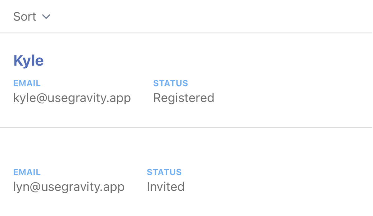
Lists are a great way to visualise a lot of content in an organised format. With Gravity Native, you can render static and interactive lists with swipe actions. You can also search, sort and filter.

Preview

You can find a full working example of a list inside the /views/account/users

Code

  <List
    data={ users }
    searchable
    sort={ 'name' }
    loading={ loading }
    onRefresh={ fetch }
    showItems={['name', 'email']}
    edit={ edit }
    delete={ delete }
  />

Props

Prop
Description
Required
Value

data

object containing data to render

required

delete

callback function to delete the item

optional

function

edit

callback function to edit the item data

optional

function

loading

toggle the loading spinner

optional

boolean

onRefresh

callback function to fetch the data when the user pulls to refresh

required

function

searchable

show a search box

optional

boolean

showActions

force render actions when using a mix of global and item-level actions

optional

boolean

showItems

array of object keys to filter which data to show from the data object

optional

string array

sort

key to sort the data object

optional

string

titleKey

object key to use as list item title

required

string

If you pass an edit or delete prop, the list will have swipe actions.

Data Format

The data prop accepts an array of objects. These can be in any format, provided there is an ID key with a unique value. Use the showItems prop to filter the object and determine which items you want to show in the UI.

[{
  id: '1cab6e3b-abc9-4738-b0d4-cfad7f308e03',
  name: 'Joseph Sandoval'
  email: 'joseph_88@example.com',
},
{
  id: '1cab6e3b-abc9-4738-b0d4-cfad7f308e03',
  name: 'Alan Reed'
  email: 'alan_reed@example.com',
}]

Edit & Delete Items

If you provide an edit or delete prop, the user can swipe the list item and tap one of the swipe actions. This will execute a callback function to manage editing or deleting the data in the parent component. You can find a working example in /views/accounts/users.

Item Actions

In addition to global edit and delete actions, you can pass a bespoke action to each list item using the following format. You can also over-ride the edit and delete actions at the item level.

{ delete: deleteInvite, custom: [{ icon: 'mail', func: resendInvite }]}

(see below)

object array